The old myth of 300 dpi in print!
It's high time for another technical tutorial.
In our fourth tutorial, I would like to dispel a rumor that is so petrified that almost the entire media world believes it.
The rumor: “Printing always needs 300 dpi!”
What now? Not at all? The whole world follows this rule!
Well, this “rule” isn't really a rule at all. It is a rule of thumb that was created in the heyday of DTP, desktop publishing. And not even this is really correct, as I would like to explain below.
What happened?
Well, at the end of the last millennium, when reprographics was replaced by desktop publishing within a very short space of time and an entire service sector disappeared in no time at all, the optimum of what modern printing presses could reproduce was a 60 raster.
Another new number, but I'll explain it in a moment.
This 60 screen was therefore a quality feature for high-resolution print production at the time.
So what is a 60' grid?
Well, in most printing processes, images are screened for polygraphic reproducibility in order to create so-called halftones. This applies to almost all color spaces, from single-color print reproductions, to the four-color printing that is common today, to multicolor printing processes such as Hexachrome (i.e. six colors) or even larger color gamuts such as in spot color printing.
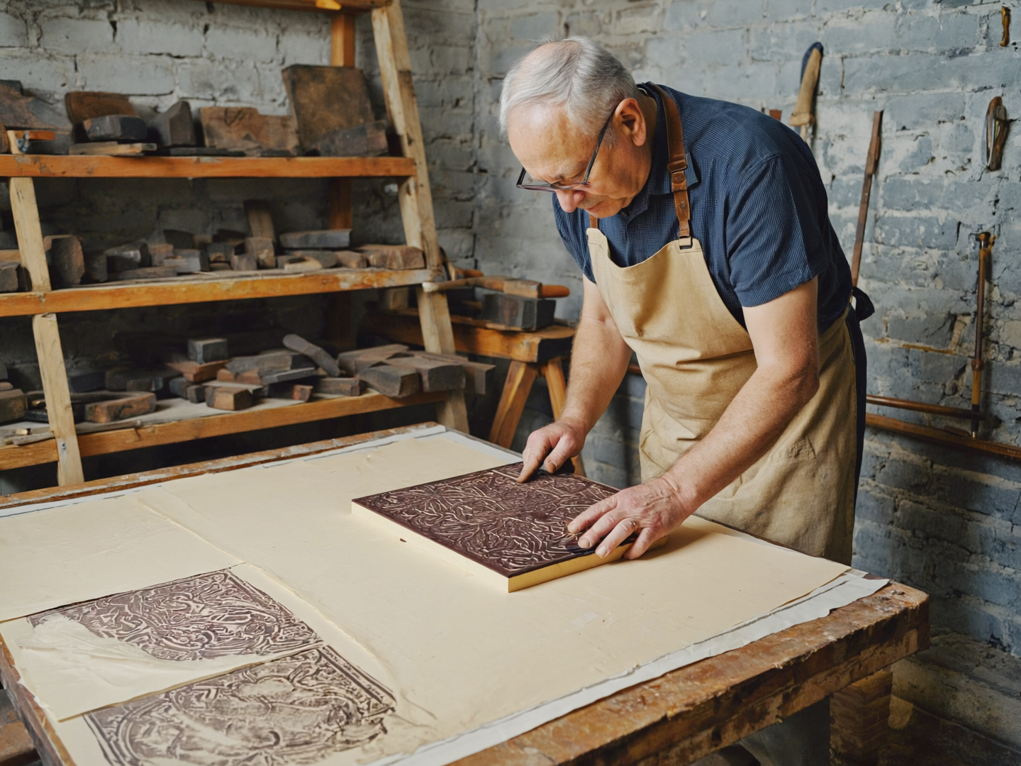
The need to screen images to create halftones is based on the various printing processes. For the sake of clarity and visualization, let's start with letterpress printing, lino printing or potato printing - i.e. the relief printing process.
Here we know that the printing form, i.e. the printing stamp, only has two states:
High, i.e. drawing, and low, i.e. not drawing.
Or to put it more figuratively:
Take a linoleum plate, wet it with printing ink, press it onto a sheet of paper and notice that the entire linoleum plate leaves an image on the sheet of paper. Then you start to use suitable tools to partially remove parts of the linoleum surface, for example to carve a circle, and repeat the process. Where the circle was cut out, the paper white remains visible after the printing process and the printing ink is transferred to the paper in all other places.
So far, so good. We have at least understood the basis of letterpress printing.
If you want to reproduce more than just a circle, you can cut a complete illustration into the linoleum by hand and thus reproduce very fine graphics. But even these graphics still only consist of full tones, i.e. either drawing or non-drawing, with black ink just black (color) and white (paper).
The creation of halftones, i.e. grey, seems rather impossible here, as you only have black color in the machine and cannot transfer it in a gradated or brightened form. However, this is in fact the basis of all halftone processes. Almost all halftone processes work solely with a technical and optical trick. Because if you were to work very, very delicately with the lino knife, so that the human eye could no longer easily recognize the fine cuts, then this would create the impression of greyscale. This actually happens in our brain and not in the eye, because as soon as you get very close or even use a magnifying glass or a thread counter, you can of course see again that it is not grey color but a multitude of filigree black and white contrasts strung together.
And it was precisely this realization that gave rise to halftone printing.

It was invented independently by Georg Meisenbach (Germany) and Frederic Ives (USA) at the end of the 19th century. Both succeeded in breaking down images, including their halftones, into individual halftone dots by exposing them through a screened glass plate, which could then be used in the already invented newspaper (letterpress) and offset printing (planographic printing) to produce printing plates.
From then on, the industrial reproduction of images and grayscales was possible. It goes without saying that the screens used at that time were still very coarse for technical reasons. This form of screening is called autotypical screening (amplitude modulated) and is still the most common form of screening today.
Over the following years, the reproduction techniques and printing possibilities were greatly optimized and the screens became finer and finer. Then came the invention of multicolour printing and soon the early colour printing (red - blue - yellow - black) and later the now common and standardized four-colour printing (CMYK).
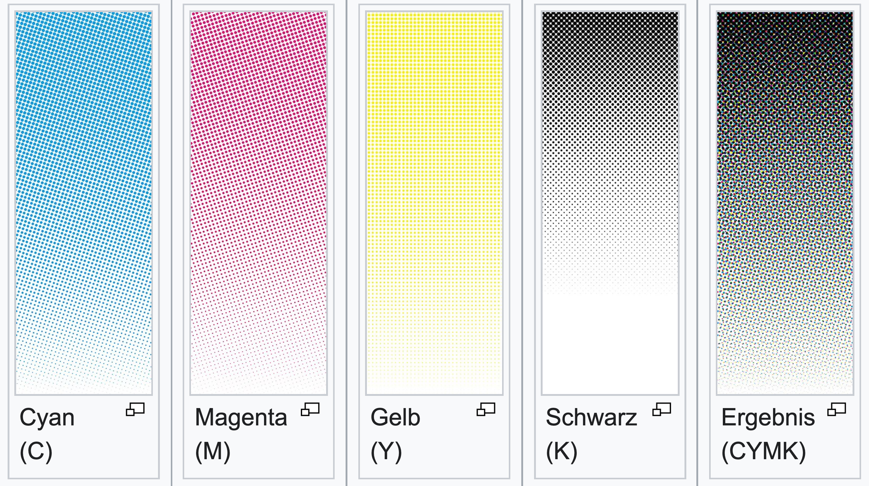
Here, it was quickly learned that by printing different transparent colors on top of each other, further colors could be created according to the theory of subtractive color mixing. And by combining this with halftone printing, the color nuances that could be produced became even finer.
Reprographics emerged from this period as a service sector of the printing industry. Previously, special screen films were used, which had a different angle for each color channel to avoid so-called moirés (unwanted interference in the printed image).
Then came the first typesetting and (film) exposure systems on a digital basis, such as those from the then market giants Linotype and Berthold. However, the use of screens was of course still necessary for reproduction and so at that time it was quite common to combine the repro films from the typesetting machines (so-called typesetting galleys), which at least at the beginning could not yet process images, with the screened repro films from the mostly analog image reproduction (repro cameras). All of this was then also mounted manually and then exposed on the printing plates.
At this time - in the early 1980s - printing presses were capable of reproducing “fine screens” of 60 lines per centimeter (60 raster). For even finer resolution screens, experiments with alcohol and dry offset (Torray) were already underway at this time and 74, and in some cases even 96, screens were reproduced.
The fact that smaller print shops in particular were still working with single-color or at most two-color presses at this time did not make the beginnings of four-color printing, which had just started, any easier.
A 60 screen was therefore a good compromise between technical feasibility and visual impression at the time, as a 60 screen in commercial printing and packaging printing, i.e. where print quality is perceived from a short distance, overcomes an optical threshold for human visual habits:
Coarser screens stand out negatively, while finer screens are often only subjectively perceived as more brilliant and of higher quality.

Then came DTP and typesetting systems were a thing of the past within a few years. Very early on, DTP systems were able to process black-and-white images and print them rasterized using film exposure (Linotype and Crossfield were the big names here). Screening was then mostly performed by large, mostly Unix-based workstations (such as SUN), which were then called Raster Image Processors (RIP) and which are still available today (from many providers and increasingly software-based) for print data processing.
Film mounting was therefore no longer necessary. At the same time, the first scanners - initially drum scanners (rotary) and later flatbed scanners - were developed and established on the market, replacing the analog reproduction of images.
The quality of the reproduced images was now also considerably higher and the use of the image data, which was now available digitally for the first time, was all the more variable and flexible, as the data sets could now be distributed quite easily via data carrier or even modem and images could suddenly be scaled very easily.
It was precisely because of this variable scalability that thought had to be given to the optimum image resolution in relation to the final reproduction scale of the image in the printed image.
If images were too small for the selected screen and the final image size, they were output with reduced quality. In some cases, the image pixels from the digital equivalent of the image were even visible in the final printed image.
However, if images were far too large in relation to the image size in the selected raster, their processing placed such a strain on the RIPs, which were not yet so powerful at the time, that they either took far too long to process the data or simply failed to work.
Therefore, the following rule of thumb was formed at that time:
The optimum resolution of a digital image requires twice the number of pixels as the selected screen in the final image scale.
Means:
An image that is to be processed in a 60 raster without loss of quality but with minimum calculation time requires 120 (60 x 2) pixels per centimeter.
Why centimeters?
Well, the specification 60 lines per centimeter is a typical German measurement and means nothing other than 60 lines per centimeter.
Why lines?
This is because today's screen specifications are actually based on (ancient) screen printing. Lines here actually refer to threads in the screen and the finer a screen is, the more threads it has per centimeter. Incidentally, this is also where the well-known term thread counter comes from, which is nothing more than a magnifying glass with a measuring scale that was used in the past to count the threads in a screen over a defined distance using the scale embedded in the base in order to be able to define the resolution of the screen in question.
Why times two?
This is also easy to explain: a sieve only ever works through the combination of many threads and the spaces between these threads. Ideally, the space between two threads is exactly the same size as the diameter of one thread.
In digital technology, this would therefore be 0 (thread - no pressure) and 1 (gap - pressure). This means that the thread and gap form a single unit for each screen.
If we now transfer this to a digital image format, we also need two pixels (or lines) if we want to display a screen (black next to white as an example). Hence the factor of two for the screen size for digital formats.
And why these ominous 300 dpi?
As described above, the 60 mm screen was initially agreed as the optimum for offset printing.
As mentioned, a 60 raster is a German, and therefore metric, size (60 lines per centimeter) and must therefore first be converted into the imperial system, as we measure the resolution in dpi (dots per inch).
So we must first multiply 60 by a factor of 2.54 (conversion from centimeters to inches), which results in 152.4. The unit is now no longer lines (threads) per centimeter but lines per inch (lpi). This means that our 60' grid in countries with an imperial system is usually a 152 lpi screening.
What is still missing is the factor two. So 2 x 152.4 = 304.8 dpi
The optimum image resolution for the 60 raster is therefore 304.8 dpi
As 304.8 dpi is more difficult to remember than 300 dpi, the rule of thumb is that a digital image resolution of 300 dpi in the unscaled final format must be available for optimum printing (in 60 raster).
The fact that 300 dpi is actually already too low is only really noticeable under laboratory conditions and that this rule of thumb only applies to the 60 dpi screen is simply forgotten over time!

But what exactly does that mean? Then it is correct that images need 300 dpi for printing, isn't it?
No, that is actually wrong.
Unfortunately, this has become so ingrained in people's minds that even software providers assume 300 dpi for print data in all basic settings. Even the raster effect resolution in Illustrator (which is used for cases where vectors should or must be converted into bitmaps) is preset to 300 dpi at high resolution. ¯\_(ツ)_/¯
But what does this mean in practice?
In practice, this means that with all printing processes that produce in finer autotypical screens than 60 lpc - and that is now almost all of them, as even regular offset has long been producing in 74 lpc or even higher as standard and art printing in particular is printed with screens up to 150 lpc - the digital image resolution is virtually always too small and you have to accept a real loss of quality, which most people are not even aware of.
If we take the example of an art print and assume a 150 raster, we can see that we have to calculate 150 x 2.54 x 2 using our formula above to determine the optimum image quality in the unscaled output format.
This means that our image would need an optimum unscaled image resolution of 762 dpi for this extremely fine raster. If we now use our images in 300 dpi in this screen, we are giving away 2.54 times 2.54 minus 1, i.e. 5.4516 theoretical screen dots per bitmap. This means that we could theoretically print almost 5.5 times finer than we deliver with our 300 dpi image. So it would almost make no difference whether we printed in a 60 dpi screen or in the much more complex and higher quality (and more expensive) 150 dpi screen. You would hardly see any difference!
But I don't make art prints!
Well, even in regular printing, i.e. commercial, packaging, ..., you lose a lot of print quality by the usual optimization of all images to 300 dpi (this is even a common default setting, for example when exporting to PDF format, and even Acrobat has all its preflights preset to this stupid 300 dpi).
Prints with correctly optimized images look far more brilliant and sharper than the same prints with images that are too small.
As already mentioned, hardly anyone prints in the 60's screen these days.
And so far we have only been talking about autotypical screening methods. Stochastic screening processes (frequency modulated) and also combinations of autotypical and stochastic are more widespread today than you might think. All the digital printing systems in particular mostly work with FM screens. And here too, images that are delivered too small have a massive impact on the print quality.
But I checked in Photoshop, my picture has 300 dpi. Why does it still pixelate in print?
If you've been paying attention, you'll notice that I'm always talking about a resolution in the unscaled final format throughout this article. What does that mean? Well, for example, if an image measures 10 x 10 cm at 300 dpi (image size in Photoshop), then you can print it in a 60 x 10 cm grid. However, if you scale this image proportionally to 20 x 20 cm in a layout program, then this image will only have 150 dpi in the desired final format and will therefore be much too small. It must therefore be pixelated, as only a quarter of the native resolution is available per screen dot (a quarter as this must of course always be calculated in squares - or in other words: you would now need four of these images to achieve the required 300 dpi horizontally and vertically).
And now? How do you get to grips with this if you want to achieve the best print result with the smallest possible data size of the final print data?
Quite simply: As soon as you are aware of the fact that 300 dpi is a global lie, a hoax, you immediately start to completely rethink and reorganize your workflows, usually unconsciously.
Today, for example, we have been working with 360 dpi image material for years in cases where we really don't know the final screen used. According to Adam Ries, this is at least sufficient up to a 70 dpi screen without any loss of quality. And all our preferences and workflows are also designed for this. Of course, this also means that all image material must be available natively in at least this resolution and should only be reduced to the ideal resolution during export.
And if we know which screen is to be used for production, and we always question this, then of course we also optimize our print data accordingly.
Incidentally, the same also applies to cases where we know that the screen used is smaller than a 60' screen - for example, for simple newspapers or large-format posters that are to be produced in offset and are usually produced in a 48' screen or less.
Such print data does not have to be delivered in 300 dpi, as this only causes unnecessary data waste and also means longer RIP times.
Large-format digital printing projects such as exhibition walls, high-rise banners and the like are an exception here. Due to the usually large viewing distance, these usually require much lower data resolutions than conventional printing projects. In addition, the print shops would regularly overwhelm us if we were to deliver the image data in the unscaled final format in 300 dpi or even higher.
This is where we usually get in touch with the print providers and ask them what image data resolution they would like and what their RIP can still reproduce. The required resolutions are usually below 29 dpi.
Ok, understood. But does that only apply to offset printing?
No. The principle applies to all printing processes in which screen resolutions higher than 60 lpc (lines per centimeter) are possible. This includes gravure printing, flexographic printing and screen printing.
In fact, there are now gravure cylinders that are pre-lined far above the 60 raster (currently up to 120 l/cm). Even in high-resolution flexographic printing, screens higher than 60 are possible today (up to 100 lines per centimeter) and meshes up to 420 (approx. 180 f/cm (threads per centimeter)) have long been available in screen printing.
So even in other printing processes, you should clearly coordinate with the print shop and the client and optimize your print data in order to achieve the optimum result in terms of the print quality that can be achieved.
Conclusion:
Nowadays you only work with the obligatory 300 dpi if you really have no idea!

We also make our tutorials available to you as a LinkedIn newsletter.
You can subscribe to it here:

New tutorials on printing & packaging, design & prepress, software & app development from Alexander Dort GmbH